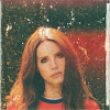
beyondthedope Posted June 18, 2014 Posted June 18, 2014 I just did these quick today and really liked how they came out. I hope you guys like them I wanted them to all to fit together. Love to hear what you think! 14 Quote
Rebel Posted June 18, 2014 Posted June 18, 2014 I like the images even though you might've over grunged them just a tiny bit, but the colors are lovely. Unsure about that handwriting typography though, it's always awkward with handwritten typefaces because you can tell they're rather unnatural. 0 Quote
beyondthedope Posted June 18, 2014 Author Posted June 18, 2014 On 6/18/2014 at 7:03 AM, Rebel said: I like the images even though you might've over grunged them just a tiny bit, but the colors are lovely. Unsure about that handwriting typography though, it's always awkward with handwritten typefaces because you can tell they're rather unnatural. I wanted to over grunge them so that's a complement to me haha. I wanted them to look like old polaroids with marker over them with the text, thanks and thanks to the people that liked my post! 0 Quote
Swan Song Posted June 18, 2014 Posted June 18, 2014 They're gorgeous. I haven't really found many covers that I like for Old Money so this is nice. 0 Quote
Sebastian Posted June 18, 2014 Posted June 18, 2014 I absolutely love 'em! How did you do that polaroid-like effect? 0 Quote
Platinum Greenwich Posted June 18, 2014 Posted June 18, 2014 i love the graffitti aesthetic; you should do more! <3 0 Quote

Recommended Posts
Join the conversation
You can post now and register later. If you have an account, sign in now to post with your account.